Experience the pacificpoint of view.
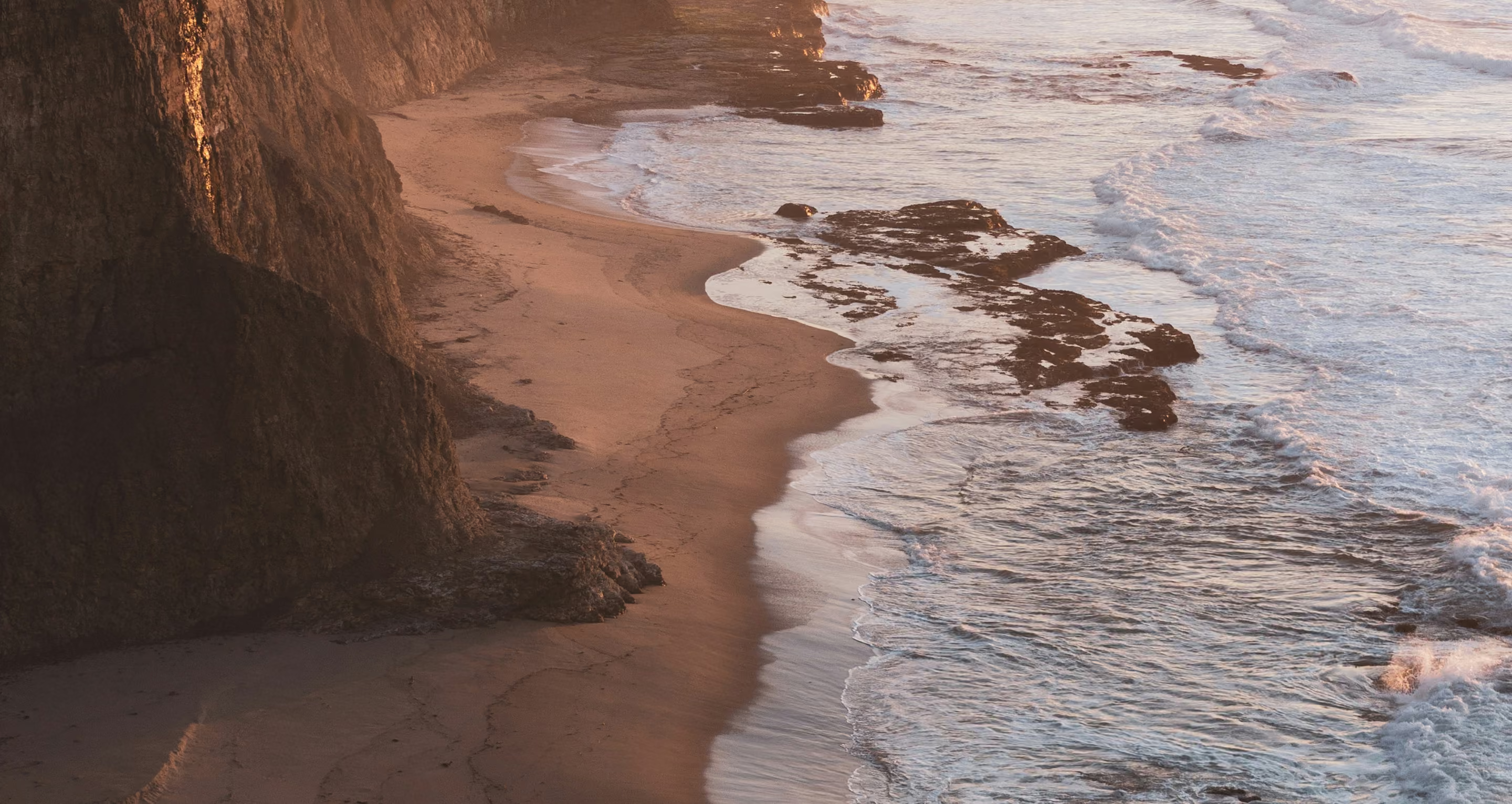
Two Central Coast icons with forty years of guest loyalty between them needed to become one destination with a distinct identity and a point of view all its own.
Arrow down link


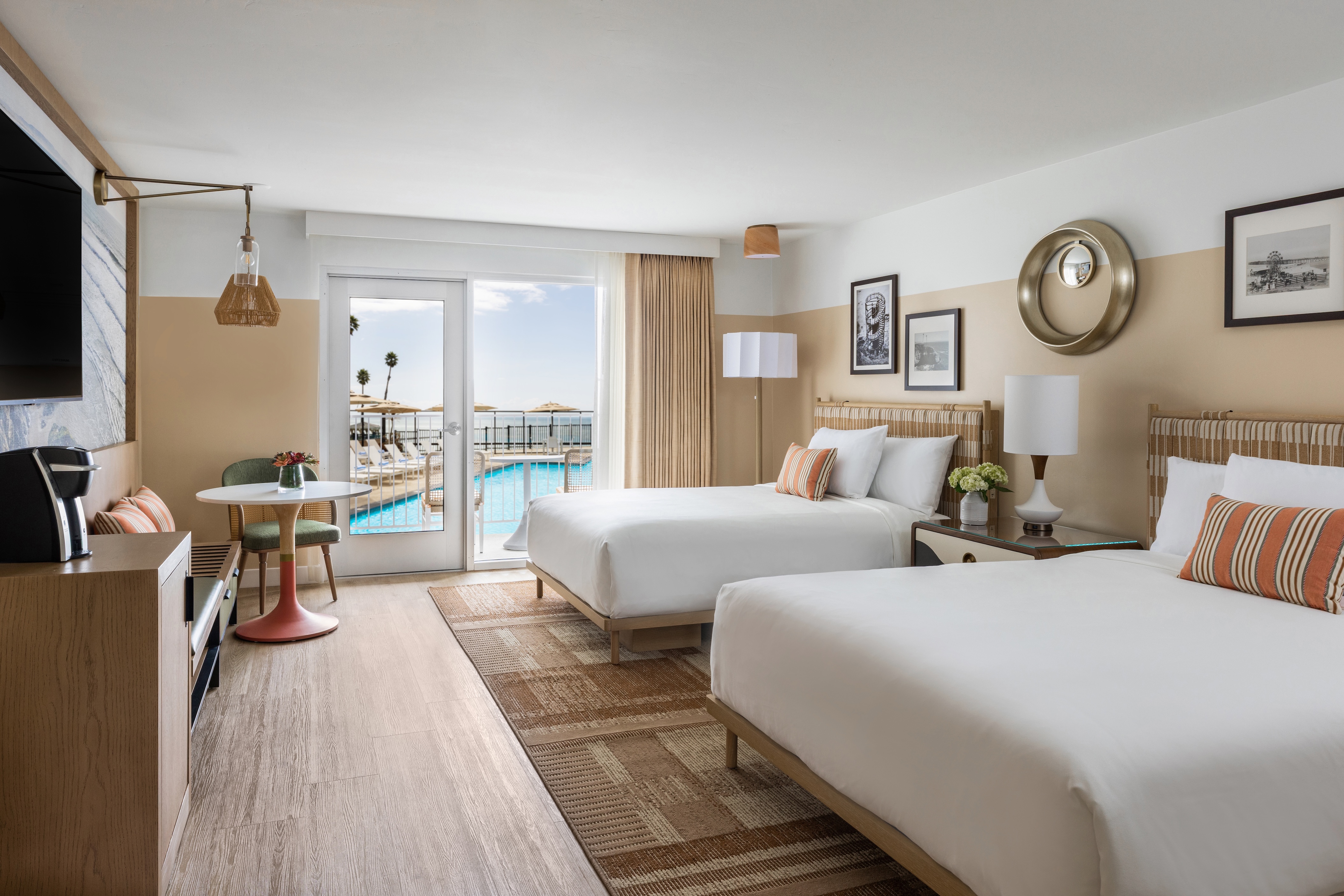

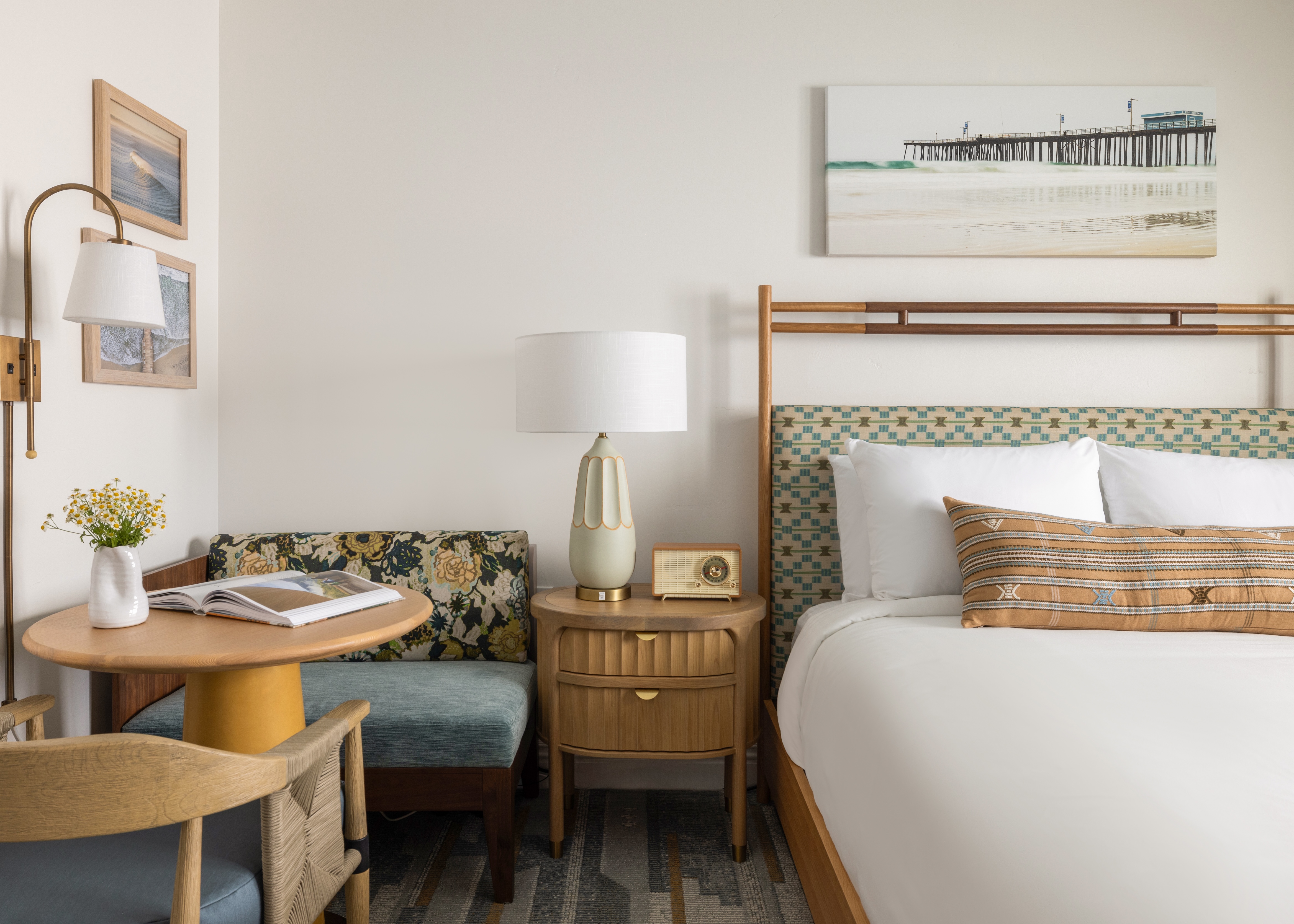


Pismo Lighthouse Suites and Shorecliff Hotel sat side by side on the Central Coast for over forty years. Together, they carried decades of guest loyalty, return visits, and an inherent tie to the hospitality ecosystem of Pismo Beach. For Peregrine Hospitality, the goal was to merge them into a single destination without losing what made either one special, while creating something new enough to compete at a higher level and attract a new generation of traveler.
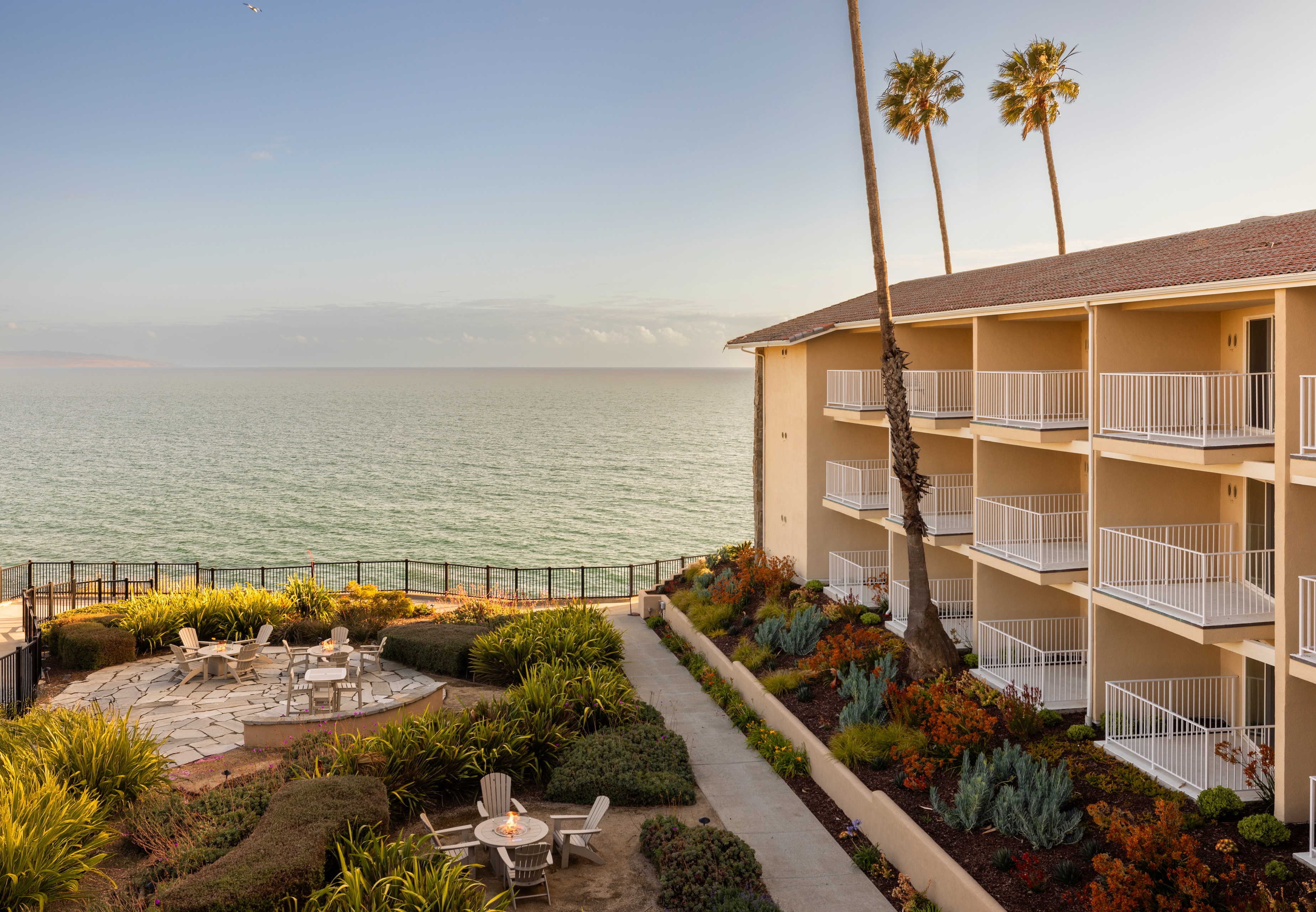
We started by going to Pismo Beach. In-market immersion, competitive touring, desktop research, guest data, travel trend analysis to build a complete picture of who was coming, why they were coming, and what the coast was and wasn't offering. What we kept returning to was the coastline itself. Not just as scenery, but as the organizing idea. Pismo Beach is defined by convergences: land and sea, surf culture and Highway One nostalgia, families and couples, restoration and adventure. The cliffside position of the resort wasn't a limitation to work around. It was a front-row seat to all of it.
That insight became the brand: Pacific Point of View. A brand built around the rare perspective that only this particular stretch of coast, at this particular elevation, can offer. The Big Idea — Champions of a Living Coastline — carries the resort's commitment to the place it sits on, honoring both its 1970s surf-culture roots and the traveler arriving today.
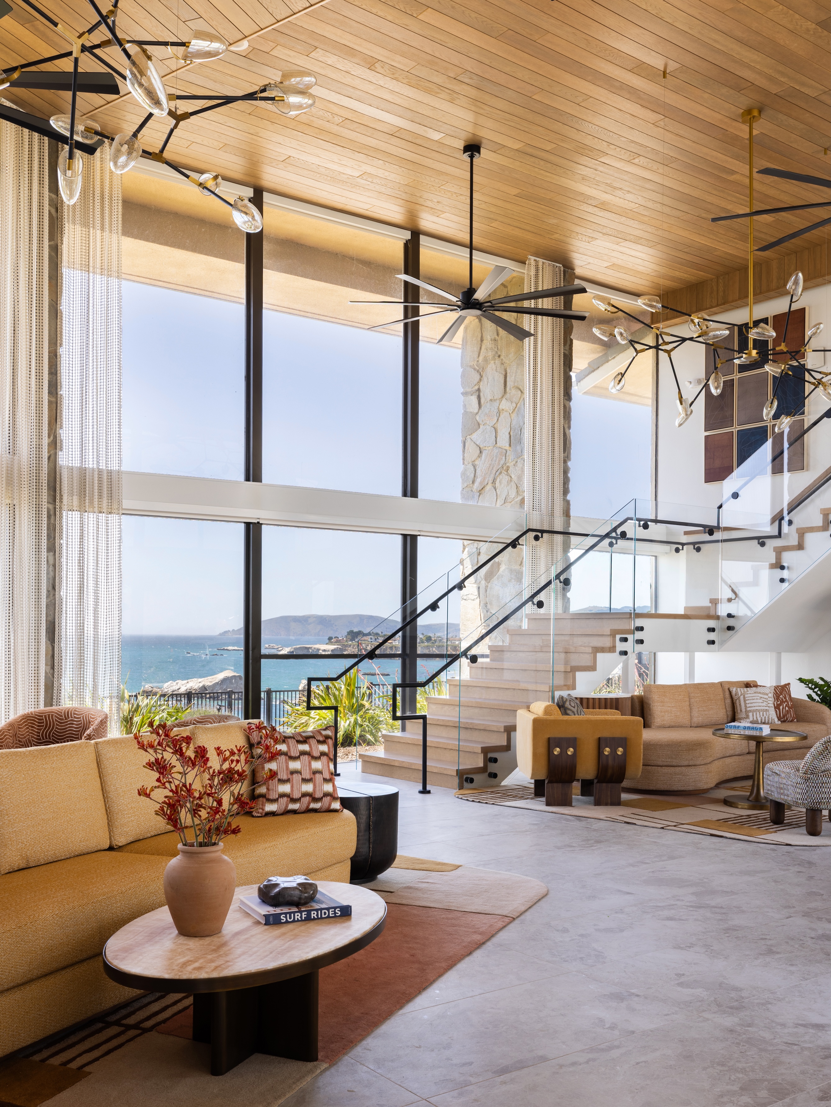
The brand pillars translate that perspective into experience. Where Land Meets Sea shapes the design philosophy: Shore Cliff rooms in earthy, bluff-inspired palettes; Lighthouse Suites in cool ocean tones; public spaces where the two meet. Service as Ecology asks the team to read and respond to each guest like the coastline responds to the tide — adaptive, attentive, never scripted. Intertidal Play ensures programming flows between energy and stillness, extending from the resort into the town of Pismo Beach itself.
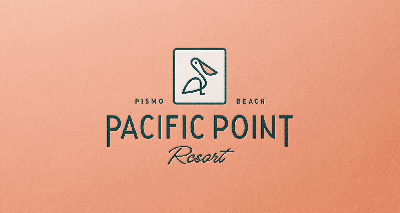
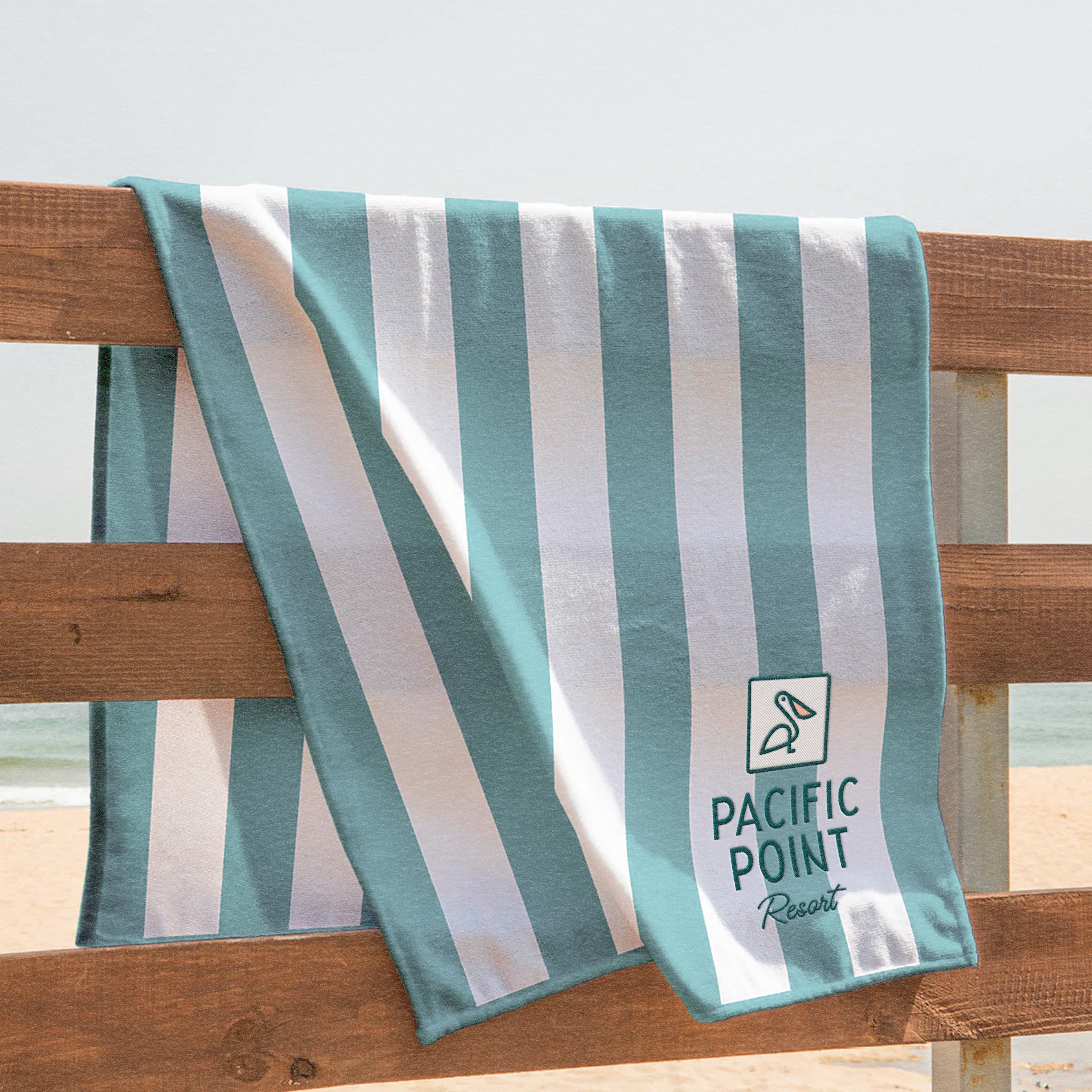
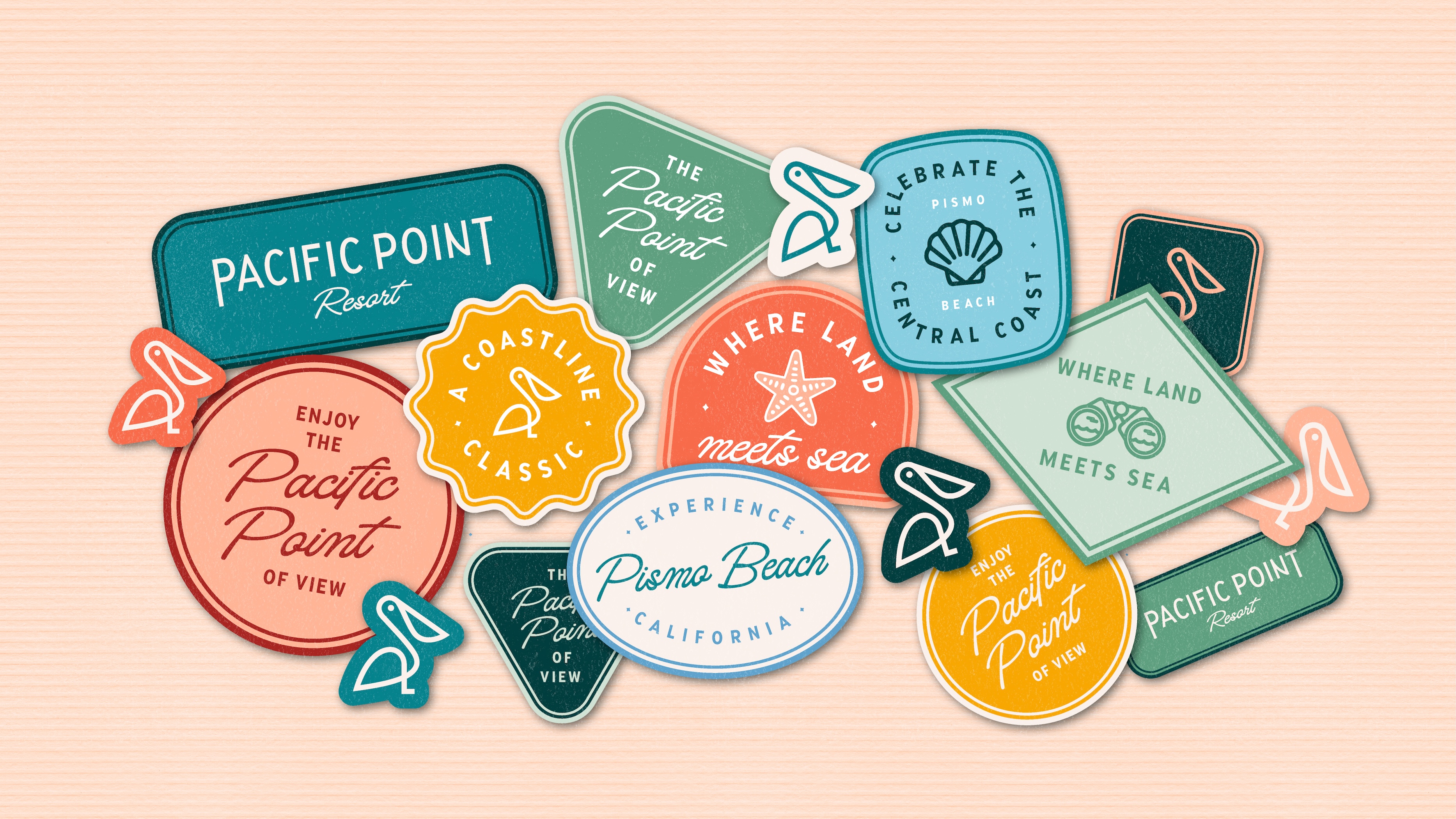
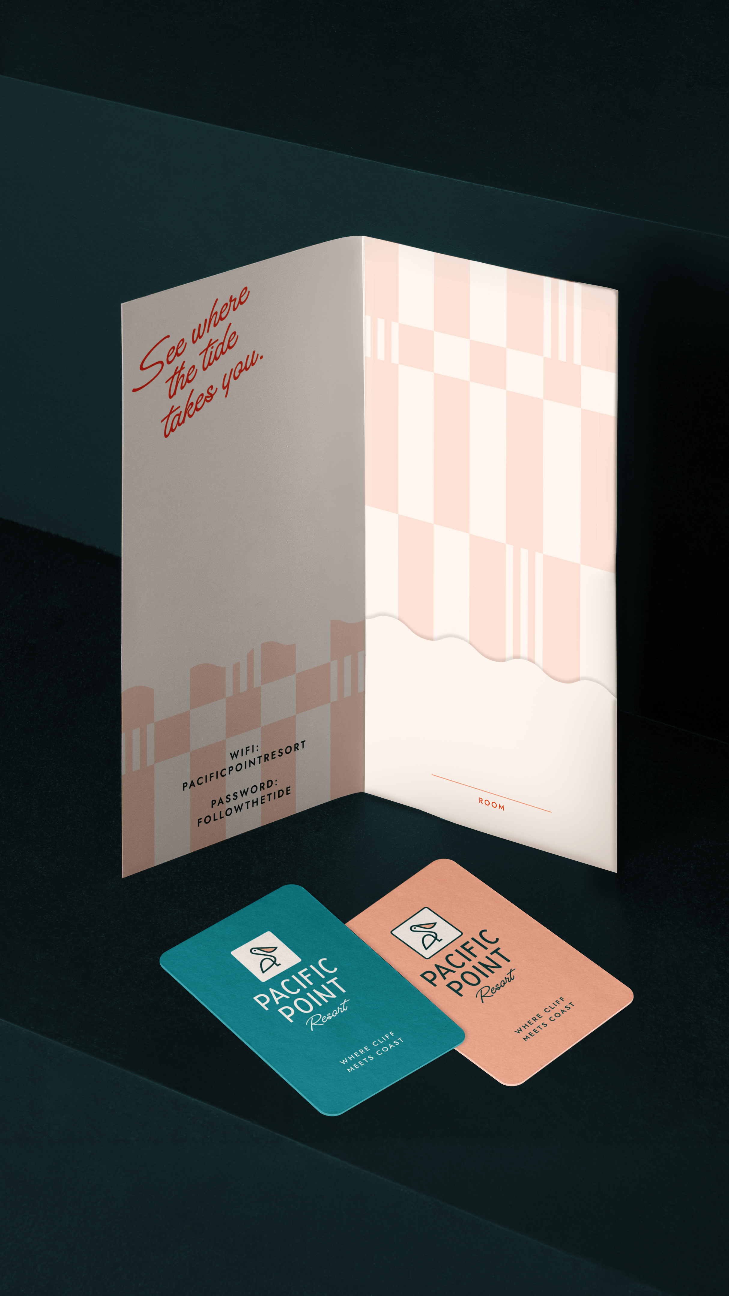
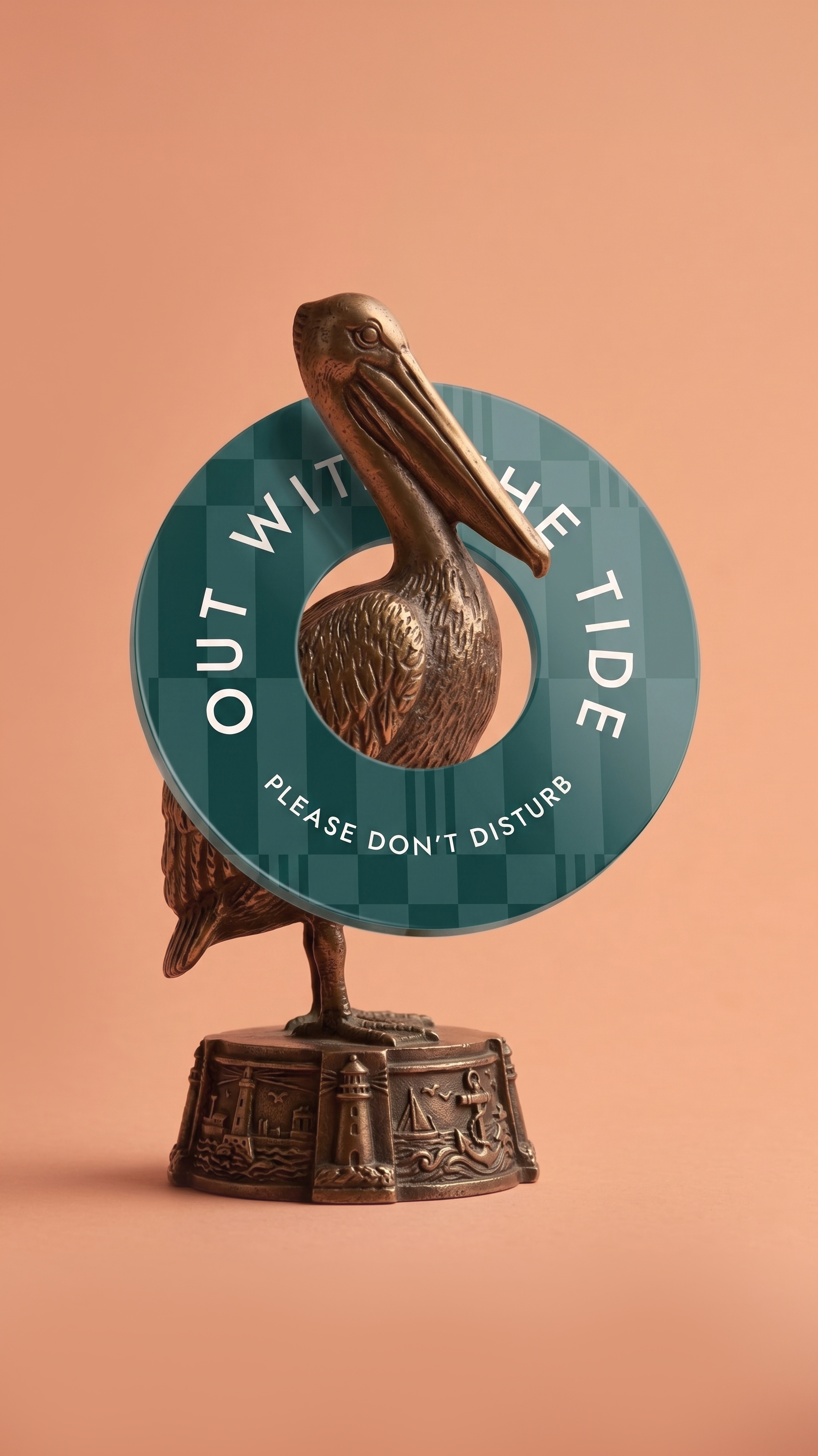
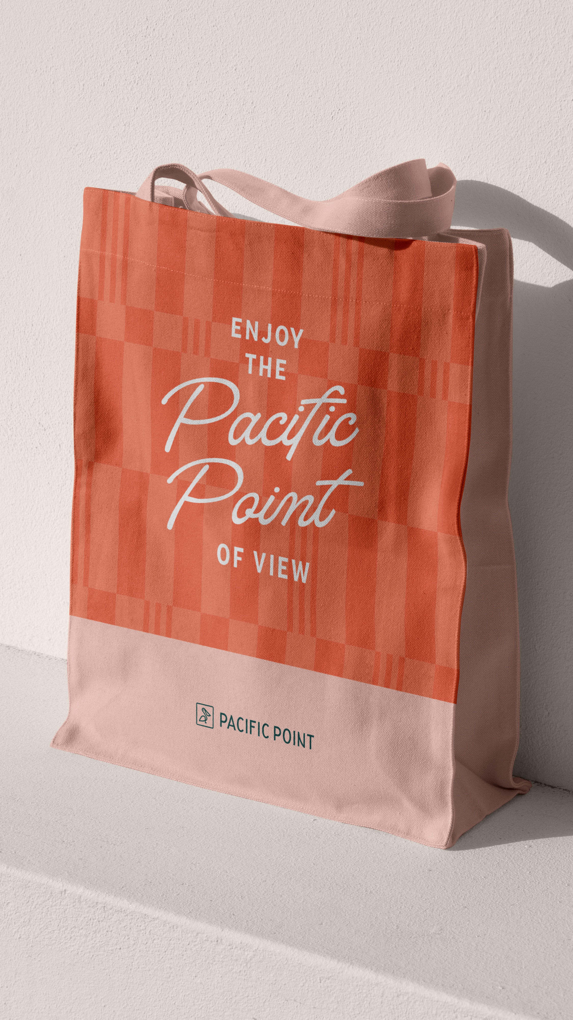
The visual identity pairs a mid-century modern pelican mark with Signaturide script and Jost — expressive and grounded in equal measure. A color palette drawn directly from the landscape, striped graphic patterns referencing beach towels and the vertical cliffs, and a rounded-square framing system that echoes the logomark bring the brand together across every touchpoint. The result is a brand that doesn't just sit on the Pismo Beach coastline. It embodies it.